About

Swivl is a field service management platform built for teams that coordinate technicians, jobs, and billing in the field — a B2B context where the primary users are predominantly male, operationally focused, and working under time pressure.

This project combined three workstreams running in parallel: a visual redesign driven by user feedback and accessibility requirements, a full design system consolidation to address years of accumulated inconsistency, and the design of four new end-to-end product flows.

Problem

User Feedback: Visual Mismatch with the Audience

Recurring feedback from male users indicated that the platform's visual language did not feel suited to them — the palette read as too feminine for a tool used primarily in a trades and field operations context. This was not a superficial concern: in products where users make fast, high-stakes decisions, visual credibility matters. A tool that feels misaligned with its users erodes trust and adoption, particularly with operationally minded, non-design-sensitive audiences.

Our existing platform for entering property data was overly complex and unintuitive. Users faced numerous fields to complete, constantly navigating between flipping cards, opening modals, and reloading pages. This cumbersome process not only extended the time required but also led to frustration and monotony.

As a result, many users reached out to our office for support, significantly increasing the workload for our agents. Instead of freeing up their time as intended, the platform inadvertently created even more work for them.

Accessibility Issues

Beyond perception, the existing colour system had real accessibility shortfalls. Several colour combinations did not meet contrast requirements, creating legibility problems for users working in bright outdoor conditions — a common scenario in field service contexts.

Our existing platform for entering property data was overly complex and unintuitive. Users faced numerous fields to complete, constantly navigating between flipping cards, opening modals, and reloading pages. This cumbersome process not only extended the time required but also led to frustration and monotony.

As a result, many users reached out to our office for support, significantly increasing the workload for our agents. Instead of freeing up their time as intended, the platform inadvertently created even more work for them.

Design System Fragmentation

Separately, the Figma environment had deteriorated significantly. The team was working on top of shadcn, but the files had drifted far from the library. Many components across the product had been detached and customised in place. There were no design tokens or Figma variables — colours, spacing, and type sizes were hardcoded per component. No rules existed for which component to use in which context, meaning different designers made inconsistent choices across the same product.

The result was a fragile, slow design environment where making a global change required hunting through dozens of individual instances.

Our existing platform for entering property data was overly complex and unintuitive. Users faced numerous fields to complete, constantly navigating between flipping cards, opening modals, and reloading pages. This cumbersome process not only extended the time required but also led to frustration and monotony.

As a result, many users reached out to our office for support, significantly increasing the workload for our agents. Instead of freeing up their time as intended, the platform inadvertently created even more work for them.

Process

Process

Audit: Mapping the Real State of the Product

We started by conducting a full audit across all product pages — cataloguing detached components, identifying inconsistencies, and documenting which elements were connected to the library versus which were floating. This gave us a clear picture of scope and helped us prioritise what to address first.

At the same time, we reviewed the colour system against WCAG contrast requirements, identifying every failing combination and mapping them against the most common use cases.

Visual Redesign: Colour and Accessibility

We developed a new colour direction that addressed both the user feedback and the accessibility failures. The updated palette shifted away from tones that read as soft or feminine toward a more neutral, grounded visual language — one that would feel professional and credible to a trades-oriented user base without being cold or heavy.

Every new colour combination was validated against WCAG AA contrast requirements, with particular attention to the text-on-background combinations most common in the product's data-dense views.

Design System Rebuild

With the new colour direction established, we rebuilt the design system from scratch in Figma:

  • Introduced Figma variables for colour, spacing, and typography — creating a proper token layer that connected Figma components to the design decisions, and aligned with shadcn naming conventions for engineering consistency

  • Replaced all detached components with properly connected library equivalents, extending the system intentionally where gaps existed

  • Removed redundant and duplicate elements, significantly reducing component count and file complexity

  • Defined usage rules and documentation: which component to use in which context, naming conventions, component hierarchy, and edge case guidance
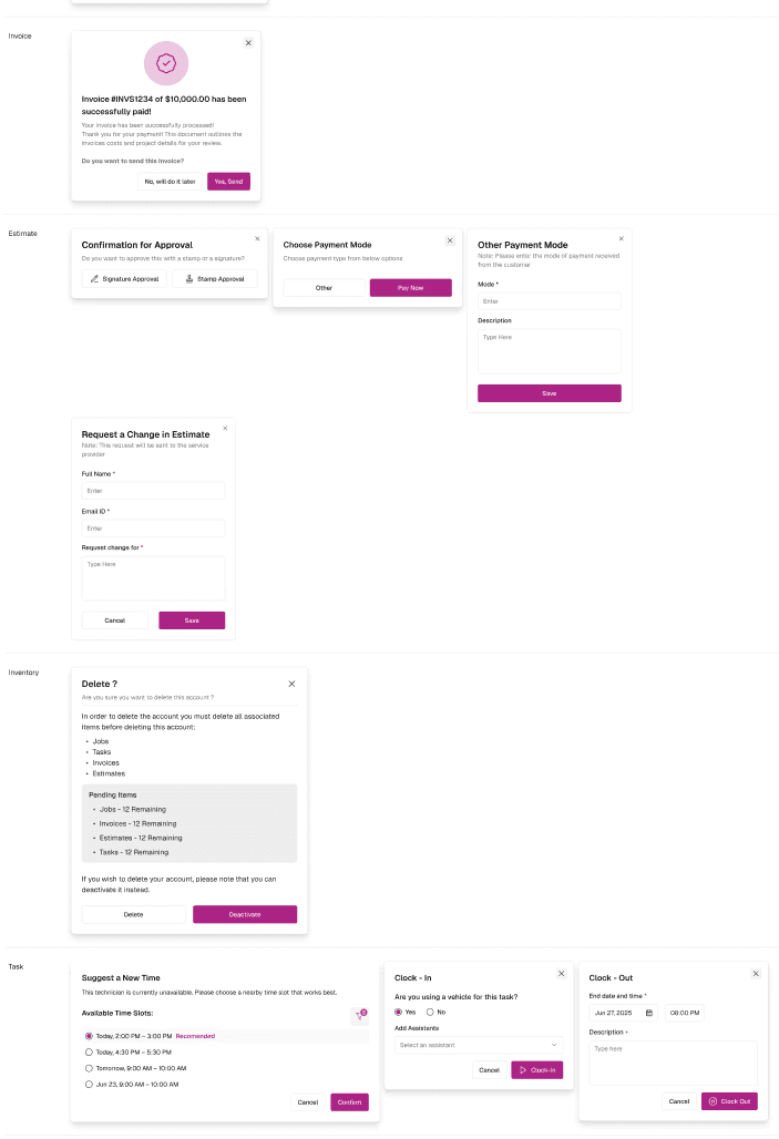
New Product Flows

Running in parallel with the system work, we designed four new core workflows from end to end:

  • Job creation — the primary workflow for dispatching work to field technicians

  • Estimate creation — allowing teams to generate and send quotes before committing to a job

  • Task creation — granular work item management within jobs

  • Invoice creation — billing flow linked to completed jobs and estimates

Each flow was designed within the new system from the outset — meaning the visual redesign and the system rebuild were validated through real product work rather than in isolation.

Outcome

Outcome

The project delivered across all three workstreams:

1️⃣

A fully rebuilt design system with Figma variables, connected components, and documented usage rules — replacing a fragile, fragmented environment with one the team can maintain and scale

A fully rebuilt design system with Figma variables, connected components, and documented usage rules — replacing a fragile, fragmented environment with one the team can maintain and scale

2️⃣ 

Beyond the specific deliverables, the project established a working foundation for the design team: a shared system with clear rules, a token layer that connects design decisions to engineering implementation, and a visual language that is consistent with who the product is actually for.

Beyond the specific deliverables, the project established a working foundation for the design team: a shared system with clear rules, a token layer that connects design decisions to engineering implementation, and a visual language that is consistent with who the product is actually for.

3️⃣

Four new end-to-end product flows that formed the backbone of the product's operational experience

Four new end-to-end product flows that formed the backbone of the product's operational experience

Reflection

Reflection

The most interesting constraint on this project was the need to run three parallel workstreams without letting any one of them block the others. Rebuilding a design system while simultaneously redesigning the visual language and designing new flows meant that decisions made in one area had immediate implications for the others.


We handled this by treating the new flows as the primary validation environment for both the colour changes and the system components — building the flows in the new system rather than retrofitting. This kept the work grounded and prevented the system rebuild from becoming an abstract exercise disconnected from real product decisions.


Working with Victoria, we divided ownership clearly while maintaining a shared view of the overall direction. The combination of component-level system work and flow-level product design gave the project depth on both the craft and the product thinking side.