Heuristic Evaluation:
When reviewing the user interfaces of Zoopla and Rightmove based on usability principles, we focused on:
Simplicity:
Both platforms prioritize simple navigation, but Rightmove tends to overwhelm users with too many options on some pages, while Zoopla’s design is slightly more streamlined.
Feedback:
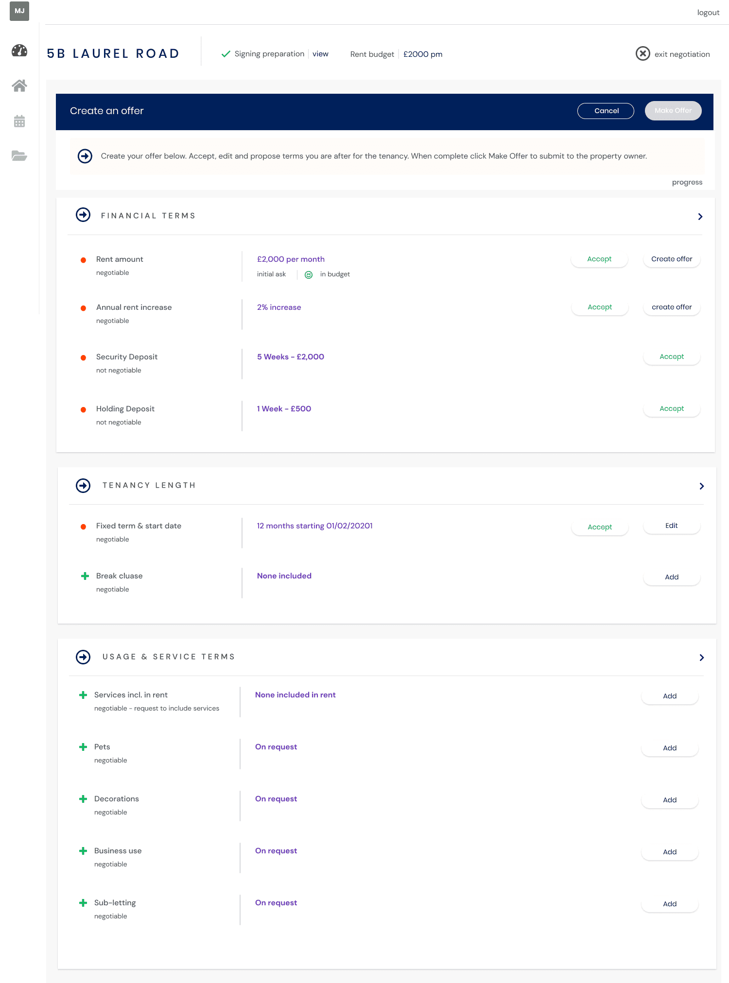
Zoopla provides more consistent feedback when users interact with different features, such as submitting an offer. Rightmove, on the other hand, lacks immediate visual or textual confirmation after completing some actions.
Error Prevention: Both platforms are good at preventing user errors by offering guidance through the process, but Rightmove could improve by reducing unnecessary steps and making the offer submission process clearer.
Consistency and Standards: Both platforms maintain consistency in their design elements (e.g., button styles, fonts). However, Zoopla follows more established patterns for error prevention and navigation, while Rightmove sometimes breaks consistency with redundant navigation options.
Visibility of System Status: Zoopla excels in showing system status by providing clear progress indicators during the offer submission process, keeping users informed of where they are in the process. Rightmove lacks detailed progress updates, which may cause confusion, especially in longer tasks.
Recognition Rather than Recall: Zoopla makes use of intuitive labeling, drop-downs, and auto-fill options, reducing the cognitive load for users. Rightmove could improve by simplifying form fields and relying more on pre-filled suggestions based on user input.
Flexibility and Efficiency of Use:
Zoopla offers shortcuts and optimizations for more experienced users, allowing for quicker navigation. In contrast, Rightmove has fewer shortcut options, making the process less efficient for users familiar with the platform.
Error Recovery: Zoopla provides more explicit and helpful error messages with clear instructions on how to recover from errors (e.g., invalid input). Rightmove, while functional, could benefit from more user-friendly, non-technical error messages and clearer recovery paths.
Aesthetic and Minimalist Design:
Zoopla uses a clean, minimalist interface with fewer distractions, improving user focus during the offer process. Rightmove tends to present more cluttered screens, which may detract from the overall user experience, especially for first-time users.
Help and Documentation:
Zoopla includes tooltips and guidance throughout the process, providing users with just-in-time help when needed. Rightmove lacks contextual help in some areas, requiring users to search for guidance elsewhere.